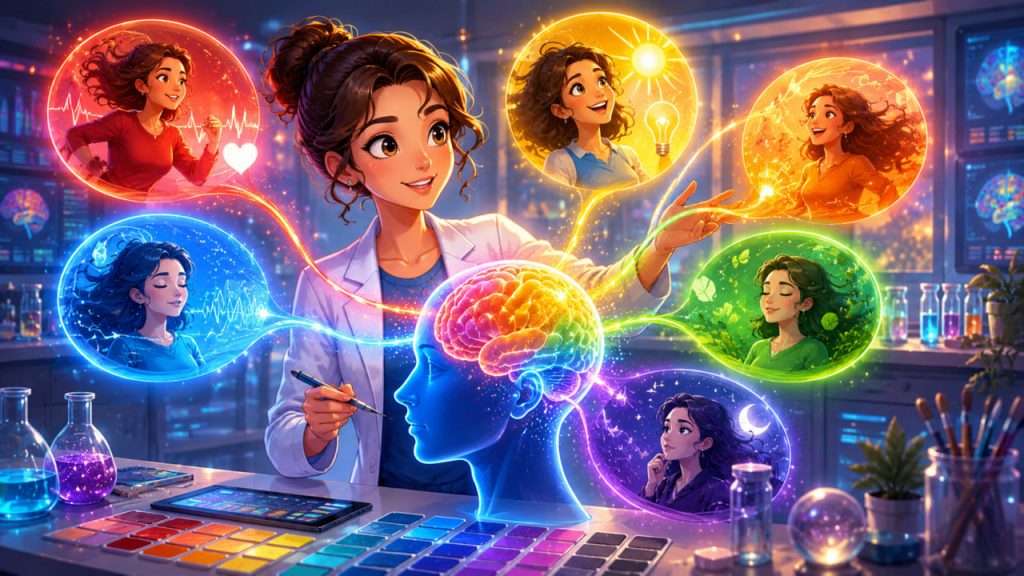
Color is everywhere: in homes, websites, clothing, classrooms, hospitals, restaurants, offices, and advertisements. We often think of color as a matter of taste, but research suggests that colors can also influence how people feel, what they notice, and how they interpret the world around them.
The psychology of color is not magic. A red wall will not automatically make someone angry, and a blue room will not instantly create calm. Color works through context, culture, memory, biology, and personal association. That is why the same color can feel exciting in one setting and stressful in another.
Modern color psychology studies how color perception connects with emotion, cognition, motivation, and behavior. Reviews by psychologists Andrew J. Elliot and Markus A. Maier show that color can carry psychological meaning and may influence affect, thinking, and action, especially when the color appears in a meaningful context.
What Is Color Psychology?
Color psychology is the study of how colors affect human emotions, thoughts, choices, and behavior.
It explores questions such as:
- Why do some people associate blue with trust?
- Why is red often used for warnings?
- Why do bright colors feel more energetic than muted ones?
- Why can the same color create different reactions in different cultures?
Color does not act alone. Its impact depends on brightness, saturation, contrast, surrounding colors, lighting, personal experience, and the situation in which it appears.
For example, red on a stop sign means danger or attention. Red roses may suggest romance. A red sale label may create urgency. The color is the same, but the meaning changes because the context changes.
How the Brain Responds to Color
Human color perception begins when light enters the eye and stimulates photoreceptor cells in the retina. The brain then processes this visual information and connects it with memory, emotion, language, and meaning.
This is why color is both physical and psychological.
A color has measurable properties, such as wavelength and brightness. But the emotional response to that color is shaped by the brain’s interpretation.
People do not simply see color. They interpret color.
A pale blue bedroom, a bright blue sports car, and a dark blue corporate logo may all create different impressions. The visual system detects color, but the mind gives it meaning.
Red: Attention, Energy, and Alertness
Red is one of the most psychologically powerful colors because it is strongly associated with attention, urgency, blood, danger, romance, heat, and competition.
In many settings, red can increase alertness. It is commonly used for warning signs, error messages, emergency signals, and urgent buttons because it quickly draws visual attention.
Research on color and psychological functioning has linked red in achievement contexts with avoidance motivation and caution. In simple terms, red may make people more alert to mistakes or threats when they are being evaluated.
That does not mean red is “bad.” In branding, sports, fashion, and entertainment, red can feel bold, passionate, powerful, and exciting.
Red is best understood as a high-intensity color. It can energize, attract attention, and create urgency, but too much red may also feel aggressive or overwhelming.
Blue: Calm, Trust, and Mental Clarity
Blue is often associated with calmness, stability, cleanliness, distance, water, sky, and professionalism.
This is why blue appears frequently in healthcare, finance, technology, and corporate branding. It can communicate reliability and order.
In interior design, softer blues are often used to create a peaceful atmosphere. In digital design, blue can feel clean and dependable.
However, blue is not always calming. A very cold, dark, or grayish blue can feel distant, sad, or sterile. A bright electric blue can feel futuristic and energetic.
The emotional effect of blue depends heavily on shade, lighting, and setting.
Green: Balance, Nature, and Recovery
Green is strongly connected with nature, growth, health, freshness, and balance.
Because green is common in natural environments, it is often used in wellness branding, environmental campaigns, hospitals, organic products, and relaxation spaces.
Green can suggest restoration because many people associate it with plants, forests, and outdoor life. It can also symbolize safety or permission, as in traffic lights and interface design.
Yet green can also carry other meanings. In some contexts, it may represent jealousy, illness, money, or inexperience.
Green is psychologically flexible. It can feel peaceful, healthy, financial, ecological, or symbolic depending on its use.
Yellow and Orange: Warmth, Optimism, and Stimulation
Yellow is commonly linked with sunlight, attention, happiness, caution, and mental energy. It is bright, visible, and emotionally active.
Orange often feels warmer, friendlier, and less aggressive than red. It is frequently used to suggest creativity, enthusiasm, affordability, and movement.
These colors can make a design feel energetic and approachable. They work well for highlights, calls to action, educational visuals, food branding, and playful environments.
But large areas of intense yellow or orange can become visually tiring.
Warm colors often stimulate attention, but they need balance. Used carefully, they can make a space or design feel alive. Used excessively, they can feel chaotic.
Black, White, and Gray: Power, Simplicity, and Control
Black is often associated with elegance, seriousness, mystery, authority, and luxury. It can make a design feel strong and premium.
White often suggests cleanliness, simplicity, purity, openness, and minimalism. It can make visual spaces feel larger and more organized.
Gray is connected with neutrality, professionalism, balance, and restraint. It can feel sophisticated, but too much gray may seem dull or emotionally flat.
These neutral colors are powerful because they shape how other colors are perceived.
A red object on a white background feels different from the same red object on a black background.
Neutral colors do not remove emotion. They control emotional intensity.
Why Culture Changes Color Meaning
Color meanings are not universal.
White may represent purity in some cultures and mourning in others. Red may represent danger, celebration, love, luck, or political identity depending on the cultural setting. Black may suggest elegance in fashion but grief in funerals.
A systematic review of 128 years of research on color and emotion found that color-emotion relationships are often “many-to-many,” meaning one color can connect with several emotions, and one emotion can connect with several colors. The review also found that lightness, saturation, and hue influence emotional associations.
This matters for global branding, website design, product packaging, education, and public communication.
A color strategy that works in one culture may not work the same way in another.
Color in Marketing and Web Design
Color strongly affects first impressions.
A website with soft blues, white space, and clean contrast may feel trustworthy. A landing page with orange buttons may feel energetic and action-oriented. A luxury brand using black, gold, and minimal design may appear premium.
In marketing, color can guide attention, separate content, highlight buttons, and reinforce brand personality.
However, color alone cannot make people trust a weak product or buy something they do not need. It works best when it supports clear messaging, good design, and a believable brand identity.
Color is not a substitute for quality. It is a signal that shapes perception.
Color in Homes, Workplaces, and Learning Spaces
Interior colors influence the mood of a space.
Soft, low-saturation colors often feel calmer. Bright, high-saturation colors tend to feel more stimulating. Warm colors can make rooms feel active and social. Cool colors can make rooms feel quieter and more focused.
For workspaces, color should match the task. A creative studio may benefit from energetic accents. A therapy room may need softness and warmth. A classroom may require enough stimulation to feel engaging without becoming distracting.
Lighting is equally important. The same wall color can look relaxing in warm natural light and harsh under cold artificial light.
Color choices should be tested in the real environment, not only on a screen or paint sample.
Expert Perspective
Psychologists Andrew J. Elliot and Markus A. Maier argue that color should be understood as more than decoration. Their research review emphasizes that color can function as a psychological stimulus, but its effects depend on meaning and context.
This expert view is important because it avoids both extremes.
Color psychology is not empty superstition. But it is also not a fixed dictionary where every color has one guaranteed emotional effect.
The most accurate approach is contextual: color matters, but it matters differently depending on where, how, and for whom it appears.
Common Mistakes About Color Psychology
One common mistake is assuming that every color has one universal meaning.
Another mistake is using color stereotypes without considering audience, culture, accessibility, or context.
For example, saying “blue always calms people” is too simplistic. A dark navy office can feel serious and stable. A bright neon blue interface can feel energetic. A gray-blue hospital corridor can feel cold.
A third mistake is ignoring readability. Beautiful colors can still fail if contrast is poor.
In practical design, emotional effect must work together with clarity, accessibility, and purpose.
Interesting Facts
- Red is one of the most attention-grabbing colors and is commonly used in warning systems.
- Blue is widely used in corporate and technology branding because it often suggests trust and stability.
- Green is strongly associated with nature, growth, health, and environmental themes.
- Color-emotion associations are influenced by brightness and saturation, not only by hue.
- The same color can create different emotions depending on culture and context.
- Neutral colors such as black, white, and gray can make brighter colors appear more powerful.
- Color psychology is used in branding, interior design, healthcare, education, advertising, and user-interface design.
Glossary
- Color Psychology — The study of how colors influence emotions, thoughts, perception, and behavior.
- Hue — The basic color category, such as red, blue, green, or yellow.
- Saturation — The intensity or purity of a color. Highly saturated colors look vivid; low-saturation colors look muted.
- Brightness — How light or dark a color appears.
- Contrast — The visual difference between colors, often used to improve readability and focus.
- Warm Colors — Colors such as red, orange, and yellow, often associated with energy, warmth, and stimulation.
- Cool Colors — Colors such as blue, green, and violet, often associated with calmness, distance, or freshness.
- Color Association — A learned or cultural connection between a color and an idea, emotion, object, or experience.
- Accessibility — Design practices that make content usable for people with different visual, cognitive, or physical needs.
- Context Effect — The way surrounding conditions change how a color is perceived and interpreted.